Pantone Colour of the Year 2020 - Classic Blue
If you’re as interior obsessed as we are at the office, then you may already know that Pantone has released their new colour prediction for 2020 – Classic Blue! Each year, the Pantone Colour Institute who consists of 5 committee members determine a colour through extensive trend forecasting research. Their predictions can set the tone for the year in what will be trending within fashion, textiles, art and design.
“A reassuring presence instilling calm,
confidence and connection” - Pantone
Blue is one of the most loved colours on the colour wheel! It can be applied to almost any environment and offers a range of shades that will suit your every interior need. Pantone 19-4052 or commonly referred to as Classic Blue, instills a sense of calmness and tranquility. Even the Classic Blue name describes its comforting aspect, bringing nostalgic images of a simpler time.
HOW DOES IT WORK?
Picture Source: Pantone
You might be asking why does Pantone release their colour of the year and how is it chosen? Well, you’re in luck because we’ve done our research! The Pantone Colour Institute are made up of psychologists, fashion designers, interior designers, product and merchandise developers. Generally, the process takes around 9 months and commences early on in March. The Committee travels all over the world including Milan, New York and Paris for research. The colour is then chosen based on where we are culturally at the moment. Previous years have seen the colour of the year named as ‘Living Coral’ for 2019 or the year Pantone made history by choosing 2 colours - ‘Rose Quartz and Serenity’ for 2016. This year, they chose Classic Blue to serve as a reminder, to pause, to take time to be in the moment and have open communication with those around us. Especially, in a world that is progressing quickly with technology.
“Brings a sense of peace and tranquility to the
human spirit, offering refuge” - Pantone
A new colour is not created for the Colour of the Year but is instead picked from within the 1,867 colours already existing within the Pantone library. Once the committee has chosen their colour and made their decision, they commence looking for proof within culture, justifying their choice.
DID YOU KNOW?
All about Colour Psychology
Colours can have an impact on our moods, make us feel different emotions and bring up specific thoughts? This all comes down to a little thing called Colour Psychology!
When you think of the colour blue, images of the ocean may pop up and a sense of peacefulness and serenity may wash over you. This is the basics of how colour psychology works and different colours will bring different images and feelings to mind.
Picture Source: Prince Design Instagram
In particular, the colour blue is usually associated with being peaceful, tranquil and serene. Some of its other most common qualities include productivity, sadness, calmness and stability. Despite being one of the most popular colours, blue can get a bad rep. Most of the time it’s overlooked and quickly dismissed. However, it is extremely versatile and its effects on your emotional psyche can be on completely opposite ends of the spectrum. Either making you feel really happy, productive and peaceful or melancholic, sad and contemplative.
Another fun fact we thought you might like to know, is that blue can actually help lower your pulse rate and body temperature!
“…A solid and dependable blue hue we can always rely on” - Pantone
I LOVE THE COLOUR!
BUT TELL ME HOW TO USE IT IN MY OWN HOME
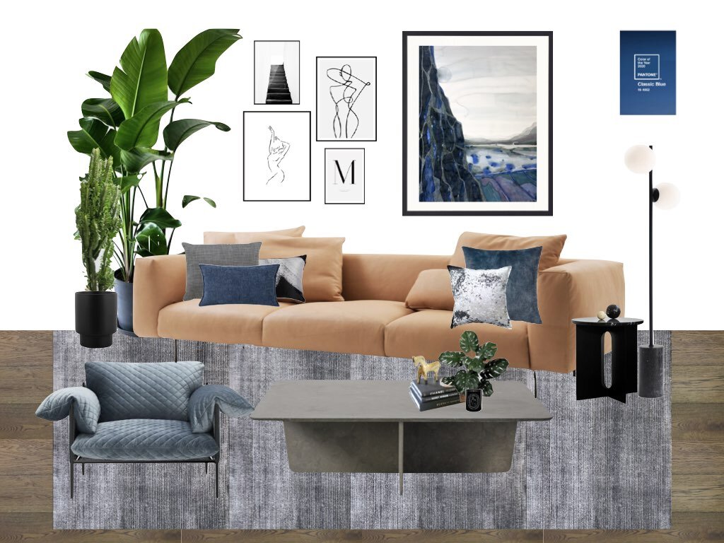
We’ve got you covered! We love talking all things design, so we had a lot of fun in coming up with different ways for you to apply the Pantone Colour of the Year to your own home. Most people will commonly associate blue with the ‘Hamptons and Coastal’ themed interiors. However, we’re here to show you that it can be applied to so much more! We recently showcased a mood board displaying a contemporary edgy design for an interior colour scheme. And we’ve taken the time to research more ways of introducing this versatile colour of the year in a multitude of interiors. Scroll down to see them!
Moodboard inspired by a Contemporary Edgy design
Picture Source: Prince Design Instagram
A Bathroom shot that we are loving!
Featuring large format blue tiles that display an aged plastered look for the walls, which has been perfectly paired with black modern accessories, to showcase a sleek European look.
Picture Source: Pinterest
OUR PICKS FOR 2020 ….
As we previously mentioned before, blue doesn’t have to mean that you are pigeonholed into a certain design style. It can be fun and exciting! Blue is such a versatile colour that it works so well with almost any colour scheme. The new Indulge Palette and the Grounded Palette from Dulux is one that will perfectly complement any shades of this hue.
The Terracotta and Berry tones from the Dulux Indulge Palette are a match made in heaven for the Classic Blue. However, if you’re after a more subtle colour palette, then you can’t go wrong with pairing it with the greys and neutrals from the Dulux Grounded Palette.
HOMEWARES, ACCESSORIES AND DECOR
Classic Blue can be applied to your home through homewares, art, cushions and paints. We have compiled a list below of our favourite picks of Classic Blue homewares and decor pieces for inspiration!
We also featured Classic Blue in our 2019 Trend Alert Blog under the Twilight Palette. Be sure to check it out for more great ideas! To see more of our top picks for 2020, click on the button below to head to our Pantone Colour of the Year Pinterest Board!
Lakes 1 - Longitude Latitude Solitude Collection
Picture Source: Andrew Vukosav
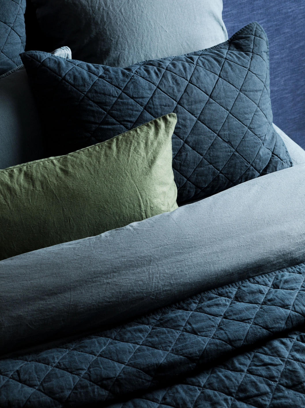
Vintage Washed Linen Steel Blue Coverlet
Picture Source: Adairs
Wanderlust Linen Cushion
Picture Source: Hawtrey
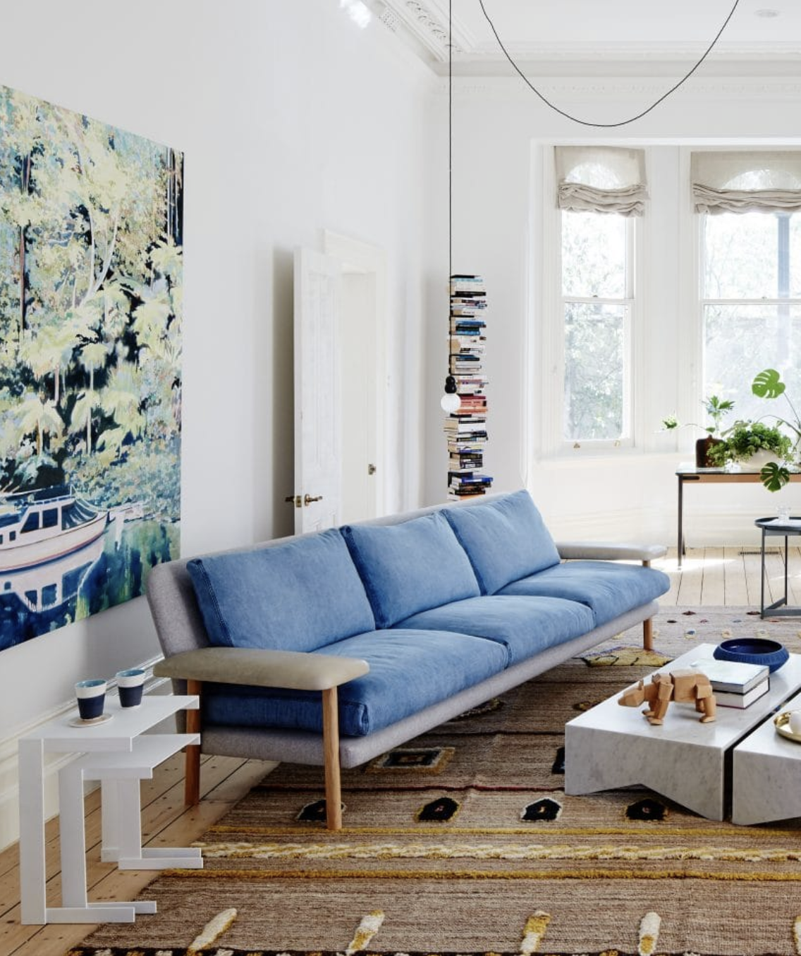
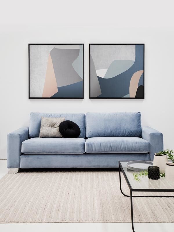
Rufus Sofa
Picture Source: Jardan Furniture
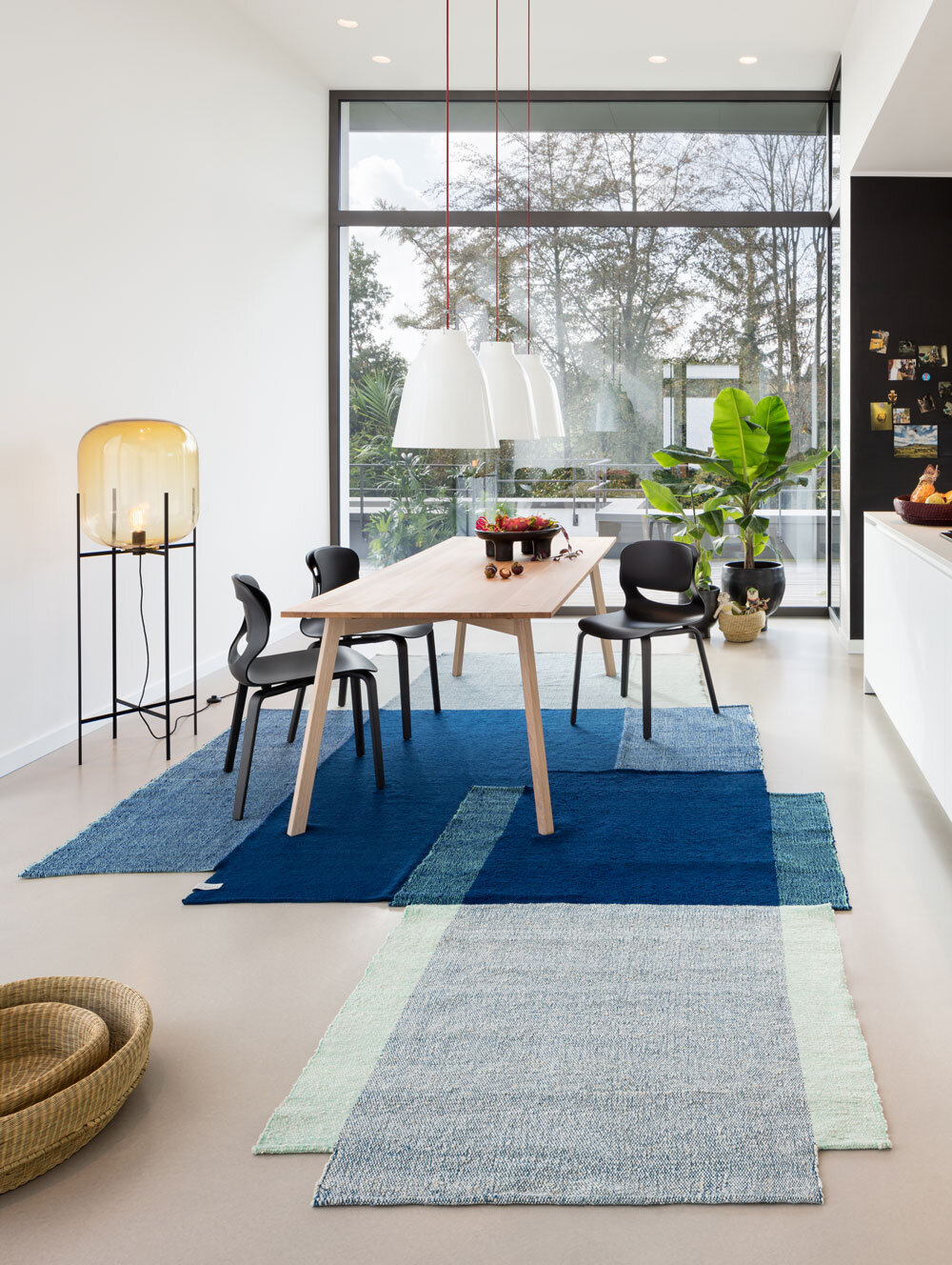
Nobsa Blue / Mint Rug
Picture Source: Halcyon Lake
Vesl Basin Square - Powder Blue
Picture Source: Nood & Co
Seaspray Vase - Mist by Papaya
Picture Source: Papaya
Rottnest Island - The Heart of Rottnest Wallpaper
Picture Source: Scandinavian Wallpaper & Decor
Soho Quilt
Picture Source: L&M Home
Facade Art Print
Picture Source: Urban Road
TU Pendants
Picture Source: Lights Lights Lights
Shoreline Vessel
Picture Source: Jardan
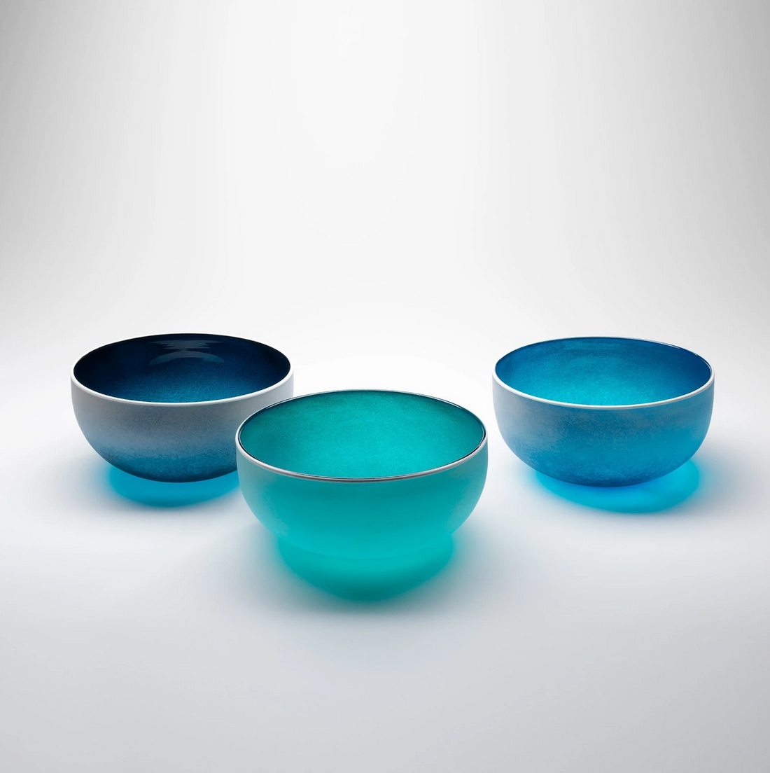
Beach Serving Bowl
Picture Source: Contemporary Co.
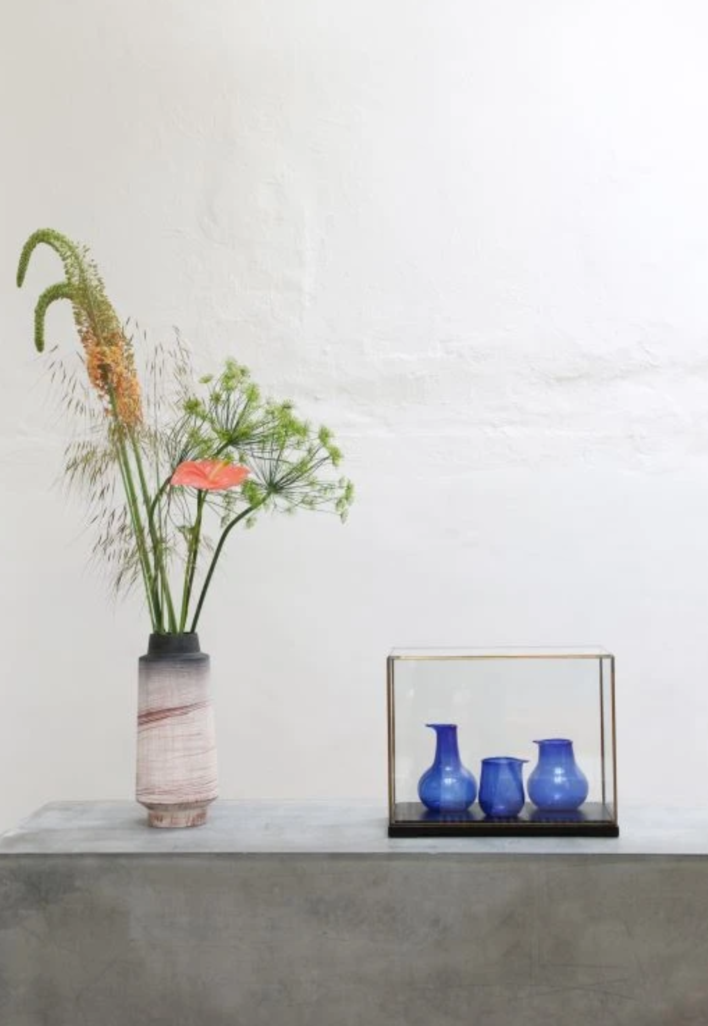
Recycled Cobalt Vases
Picture Source: House of Orange


